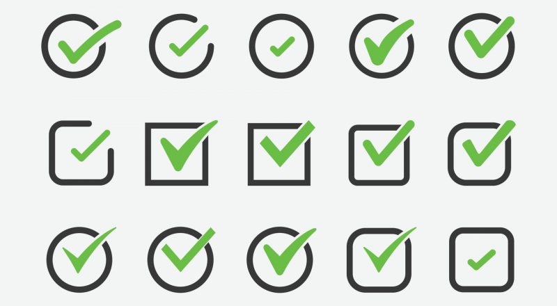
Introduction: The Importance of Tick Icons
Ever clicked on a website or opened an app and felt an immediate sense of trust just because of that little green tick icon? It’s amazing how such a tiny symbol can pack such a big punch. Tick icons, often associated with verification, approval, and positivity, hold a significant place in design and user experience. But what makes a tick icon effective, and how do you design one that genuinely connects with your audience?
1. Universality of the Tick Icon
- Origin of the Tick Symbol
The tick, or checkmark as it’s known in some regions, isn’t a new symbol. Historically, it was used as a mark of agreement or correctness. Over time, it evolved into a universal symbol for approval and positive acknowledgment. - Worldwide Recognition
Today, the tick icon transcends cultures and languages. From online shopping platforms confirming your purchase to social media profiles indicating verified status, the tick is globally recognized. Isn’t it fascinating how a simple curve can mean the same thing across different continents?
2. Effective Design Elements
- Simplicity
Simplicity is the key. A well-designed tick icon doesn’t need to be complex. In fact, its beauty lies in its straightforwardness. Imagine trying to identify a tick icon that’s too ornate; it loses its immediacy, right? - Color Selection
Color matters. Green is often associated with go, yes, and approval. However, depending on the context, different shades or even entirely different colors might be more appropriate. Have you ever noticed how blue ticks often signify verification on social platforms? - Size Matters
Not too big, not too small. It’s not just the story of Goldilocks; it’s also the mantra for tick icon design. The tick should be visible without overshadowing the content around it.
3. Emotional Connection
- Trustworthiness
When users see a tick icon, they instinctively feel a sense of trust. It’s almost like getting a nod from a friend. A well-designed tick icon can foster trust and credibility for your brand or platform. - Positivity
Beyond trust, the tick also brings a wave of positivity. It’s a confirmation that “All is good!” or “You’re on the right track!”.
4. Common Pitfalls in Designing Tick Icons
- Over-complication
Remember the KISS principle? “Keep It Simple, Stupid!” Over-complicating the design can dilute the impact of the tick icon. - Improper Sizing
A tick icon that’s too small becomes invisible, while one that’s too large can be jarring. Balance is crucial.
5. Tips for Designing a Perfect Tick Icon
- Focus on Visibility
Ensure the tick icon stands out but doesn’t scream for attention. Subtle yet noticeable, that’s the goal. - Avoid Distractive Elements
A tick surrounded by too many elements can get lost in the crowd. Give it the space it deserves. - Test in Multiple Scenarios
How does your tick icon look on a mobile screen? Or in a printed document? Always test to ensure versatility.
Making Your Tick Icon Shine
In a digital world where trust and clarity are paramount, the humble tick icon stands tall as a beacon of assurance. By embracing the design principles above, you can create a tick icon that not only looks good but also resonates emotionally with your audience. After all, isn’t it all about making that positive connection?
FAQs
- Why is the tick icon often green?
Green is traditionally associated with approval, positivity, and “go ahead.” Hence, it’s a natural choice for tick icons. - Can I use colors other than green for tick icons?
Absolutely! While green is common, the context and platform might dictate the use of other colors. - Is it necessary for the tick icon to be simple?
While not a hard rule, simplicity often ensures immediate recognition and effectiveness. - How big should my tick icon be?
The size should be balanced. It should stand out without overwhelming the content around it. - Where should I use tick icons?
Tick icons can be used in various scenarios: verification badges, approval indicators, positive acknowledgments, and more.
Best Practices for Using Tick Icons in User Interfaces
Ever noticed that little green checkmark next to a task you’ve completed on an app or a website? That’s a tick icon, and its role in user interfaces (UI) is far more critical than you might think. Dive in as we explore its evolution, purpose, and best practices in today’s digital landscape.
The Importance of Tick Icons
How often have you felt a sense of satisfaction upon seeing a tick mark next to an item on your to-do list? Translating that feeling into the digital world is essential for crafting intuitive and user-friendly experiences. Tick icons are a visual representation of completion, correctness, or verification. And guess what? They’re more nuanced than you’d think.
The Evolution of the Tick Icon in UI
In our rapidly digitizing world, where the interface of every app and website strives for instant clarity and user-friendliness, the tick icon stands out as a universal symbol of affirmation and success. How did this simple checkmark evolve into a foundational element of user interfaces?
The Tick’s Timeless Appeal
Before diving deep into its evolution, it’s vital to grasp the inherent appeal of the tick. At its core, it conveys positivity, completion, and assurance – crucial feelings for any user interface trying to foster trust and engagement.
From Analog Days: The Birth of the Tick
Paper Lists and Physical Checks
Long before digital screens graced our pockets, tick marks adorned paper checklists worldwide. From grocery lists to voter ballots, the act of putting a checkmark next to an item symbolized its completion or correctness. It was a universal, unspoken language of task fulfillment.
Transition to Early Digital Platforms
With the dawn of the digital era, the tactile satisfaction of manually ticking off a task transitioned to early computer systems. Simple graphical representations of checkmarks began to appear, indicating selections, options, or successful actions.
Adapting to Modern Design Aesthetics
Mobile-first Design and Tick Icons
As technology advanced and mobile devices became commonplace, the importance of immediate visual feedback became paramount. The tick icon, with its straightforward design and unmistakable meaning, was perfectly suited for mobile-first designs. It offered clarity in the compact space of mobile screens.
The Integration with UX/UI Patterns
In today’s complex web and app designs, the tick icon weaves seamlessly into various UX/UI patterns. Whether indicating a completed step in a multi-stage process, signaling a successful transaction, or confirming a user’s choice, the tick has become an essential tool in the designer’s kit.
The Universal Language of the Tick Icon
Multicultural Recognition
Whether in New York, New Delhi, or Nairobi, a tick remains a tick. Its design and significance cut across linguistic and cultural barriers, making it a truly global UI element.
The Psychological Power of the Tick
Beyond design, the tick touches a psychological chord. It resonates with our innate desire for affirmation and success. Each tick icon encountered in a digital journey reassures, making experiences more intuitive and user-centric.
Future Prospects: Where is the Tick Icon Headed?
Evolving Design Principles
While the essence of the tick remains consistent, its design may continue to evolve, adapting to emerging aesthetic trends. We might see it integrated more fluidly with animations, micro-interactions, and even augmented reality interfaces.
The Potential of Animated Tick Icons
As UI designs become more dynamic, the humble tick might not just be static. Animated tick icons, bursting into view upon a task’s completion or subtly confirming a choice, could be the next step in its evolution.
Conclusion: The Tick’s Evergreen Role in Digital Design
The journey of the tick icon, from paper checklists to its ubiquitous presence in modern UI, is a testament to its universal appeal and adaptability. As the digital landscape continues to change, one can be sure that the tick will find its place, affirming and reassuring users in the countless digital interactions of tomorrow.
Significance in Modern Design
In today’s world of infinite scrolling and information overload, clarity is key. The tick icon offers instant recognition, bridging the gap between user actions and system feedback. Whether it’s a successful payment or a message delivered, the tick confirms and comforts.
Why Use Tick Icons?
In the vast universe of icons and symbols available to designers, the tick stands out as a universally recognized marker. But what makes this seemingly straightforward symbol so powerful in the realm of digital design and user interfaces?
Introduction: The Power of a Simple Symbol
A tick, at its essence, is an affirmation. Whether you’re glancing at a to-do list, shopping online, or navigating an app, the presence of this modest icon imparts clarity, reassurance, and a sense of accomplishment.
Affirmation in a Digital Landscape
A Universal Sign of Completion
From ancient manuscripts to modern-day apps, the tick has always signified completion or correctness. In a digital environment, this universality ensures that regardless of the user’s background, language, or culture, the message of the tick is immediately understood.
Reducing Cognitive Load
Digital platforms are often bustling with information. By using tick icons, designers can reduce the cognitive load on users. Instead of reading lengthy confirmation messages, a single tick provides instantaneous feedback, allowing users to process information more efficiently.
Enhancing User Experience (UX)
Immediate Feedback
Imagine making an online transaction without any indication of its success. Sounds nerve-wracking, right? The tick icon serves this exact purpose. It provides users with immediate feedback, letting them know that their action – be it a purchase, a selection, or a submission – has been successfully registered.
Building User Trust
Consistency is key in establishing trust. When users recognize a pattern, like seeing a tick icon every time they complete an action, it fosters a sense of predictability and reliability. Over time, this consistent use of the tick icon can enhance users’ trust in a platform.
Adaptability Across Platforms
Responsive Design Affinity
One of the tick icon’s strengths is its adaptability. Whether viewed on a large desktop screen, a tablet, or a smartphone, the tick maintains its clarity and significance. Its simplistic design ensures it doesn’t lose its essence, even when scaled down for smaller devices.
Versatility in Functionality
From checkboxes in forms to badges for verified profiles, the tick icon seamlessly fits into various functionalities across platforms. Its design is such that it can convey a plethora of meanings, from approval to achievement, all while maintaining its core essence of affirmation.
Conclusion: More Than Just a Checkmark
The tick icon’s ubiquitous presence in digital interfaces is no accident. Its universal appeal, coupled with its ability to enhance user experience and trust, makes it an invaluable tool in the designer’s arsenal. The next time you encounter a tick icon during your digital journey, take a moment to appreciate the profound simplicity and purpose it brings to the vast digital landscape.
Guidelines for Implementing Tick Icons
Guidelines for Implementing Tick Icons
The tick icon, with its universal appeal and simplicity, is an indispensable tool in user interface design. However, its efficacy depends largely on its proper implementation. Here’s a comprehensive guide to seamlessly integrate tick icons into your digital designs.
Introduction: The Tick’s Significance
Understanding the tick icon’s importance is the first step. A symbol of affirmation, completion, and correctness, it communicates vital information quickly and efficiently, fostering user trust and enhancing the overall user experience.
Recognizing the Purpose
Completion Indication
If you’re using the tick icon to indicate task completion, such as finalizing a setup or finishing a tutorial, it should be clear and instantaneous. Its presentation should be timed precisely at the moment of completion to provide instant feedback.
Approval and Verification
For platforms requiring user validation, such as social media profiles or e-commerce checkouts, the tick icon can symbolize approval or verification. Its placement should be close to the element it’s affirming to avoid any ambiguity.
Placement and Visibility
Positioning for Maximum Clarity
Avoid placing tick icons in cluttered areas of your interface. Ideally, they should have sufficient space around them to stand out, ensuring users recognize their significance immediately.
Size and Scaling Considerations
Ensure the tick icon scales appropriately across devices. It should be large enough to be noticeable but not so large that it dominates other essential interface elements.
Color and Design
Using Brand-Compatible Colors
While green is universally associated with affirmation and correctness, it’s essential to align the tick icon’s color with your brand’s palette. Ensure it contrasts well with the background for visibility while maintaining brand consistency.
Modernizing the Tick’s Design
Consider modern design aesthetics. While the traditional checkmark is universally recognized, adding subtle design elements, like soft shadows or gradients, can make it more visually appealing.
Accessibility Concerns
Ensuring Compatibility with Screen Readers
Accessibility should be at the forefront of design decisions. If your tick icon conveys vital information, ensure it’s detectable by screen readers and is accompanied by appropriate alternative text.
Catering to Color-Blind Users
Color choices, especially for essential icons like the tick, should be made with color-blind users in mind. Testing with color-blindness simulation tools can ensure your tick icon is visible and understandable by all.
Perfecting the Use of Tick Icons
Implementing tick icons goes beyond just placing a checkmark on a screen. Recognizing its purpose, ensuring it’s clear and visible, and making design choices that cater to all users ensure its effectiveness. With careful consideration and adherence to these guidelines, tick icons can enhance user experience and clarity across your digital platform.
Common Mistakes to Avoid
Overuse
Tick icons are powerful, but that doesn’t mean they should pop up everywhere. Overuse dilutes their impact. Would you high-five someone after every word they say? Probably not.
Ambiguous Meaning
Ensure your tick icons have a clear purpose. Avoid scenarios where users scratch their heads, wondering, “What does that tick mean again?”
Clashing with Design Aesthetics
Your tick icon should complement your design, not clash with it. Think of it as a guest at a party – it should blend in while still making its presence felt.
Tick icons, though seemingly minor, play a pivotal role in enhancing user experience. When implemented thoughtfully, they bridge the gap between user actions and system feedback, ensuring smooth digital interactions. So the next time you see that comforting little checkmark, give a nod to the world of UI design, where even the tiniest details matter.
FAQs
- Why are tick icons typically green?
- Green is often associated with positivity, correctness, and go-ahead, making it a natural choice for tick icons.
- Can I use tick icons in colors other than green?
- Absolutely! Just ensure they align with your design and provide sufficient contrast for visibility.
- Where should I avoid placing tick icons?
- Avoid ambiguous placements. For example, don’t place a tick icon next to an action item unless it has been completed or verified.
- Do all user interfaces need tick icons?
- Not necessarily. Use them where they add value and clarity, and enhance the user experience.
- How can I ensure my tick icon stands out but doesn’t dominate the design?
- Balance is key. Ensure the size, color, and placement complement other UI elements without overshadowing them.
The Psychology Behind Tick Icons: What You Need to Know
Introduction to Tick Icons
Ever noticed that tiny little tick icon next to a person’s username or a brand’s name? Have you ever wondered why it makes you feel a certain way? That’s because the tick icon is more than just a symbol; it’s an emblem of approval, validation, and trustworthiness. Let’s dive deep into the captivating world of tick icons and understand its psychology.
The Evolution of the Tick
Early Uses
The tick, or checkmark as some might call it, has been around for a long time. Historically, it was a simple mark used to denote approval or completion. Teachers used it to mark correct answers, and workers used it as a way to confirm completion of tasks.
Modern Adaptations
With the rise of the digital age, the tick took on new meaning. Platforms like Twitter, Instagram, and Facebook adopted it as a symbol of authenticity. Verified accounts started sporting this tick, turning it into a symbol of legitimacy and importance.
The Psychology of Approval
Seeking Validation
We, humans, are inherently social creatures. We thrive on approval and validation. Remember the joy when your teacher gave you a tick on your homework? The same principle applies here. In the digital world, a tick icon serves as that pat on the back, signifying that you’re recognized and authentic.
Fear of Missing Out (FOMO)
Another reason for the tick’s importance is the pervasive sense of FOMO. When we see others getting verified and earning that coveted tick, we desire it too. It becomes a status symbol, an emblem of being “in the loop.”
The Power of a Tick in Communication
In today’s digital age, the sheer volume of information we process and the countless interactions we engage in can sometimes feel overwhelming. Amidst the deluge of texts, images, and notifications, the simple tick icon stands out as a beacon of clarity. But why does such a small symbol hold so much weight in our communication? Let’s delve deeper.
A Symbol of Confirmation
How many times have you sent a message and eagerly awaited that little tick to turn blue, or double tick, indicating your message was read? In instant messaging platforms like WhatsApp, the tick is more than just a design element. It’s an assurance, a digital nod that says, “Your message has reached its destination and has been acknowledged.”
Bridging the Gap of Digital Ambiguity
Unlike face-to-face interactions where body language and vocal tones can give away a lot, digital communications often lack this depth. The tick bridges this gap. It offers a tangible sign, a clarity amidst the ambiguity. Whether it’s marking an important email as ‘read’ or signifying task completion in a project management tool, the tick serves as a clear, universal symbol of affirmation.
Emphasizing Authenticity
As we navigate the vast expanse of the internet, determining authenticity becomes crucial. Here, the tick plays a pivotal role. Social media platforms use verification ticks to indicate genuine profiles of public figures, celebrities, and brands. This tiny symbol, when placed next to a name, assures us that we’re engaging with the real deal and not an imposter.
Simplifying Interactions
In our fast-paced lives, brevity is king. Why type out a lengthy response when a simple tick emoji can convey agreement, completion, or acknowledgment? It’s succinct, universally understood, and gets the point across without any fuss.
The tick, in its various forms and contexts, is more than just a mark. It’s a powerful tool in our communication arsenal, offering confirmation, clarity, and credibility. As we continue to evolve and adapt in the digital realm, the significance of symbols like the tick becomes even more profound. They streamline interactions, provide assurance, and more importantly, keep us connected in an increasingly disconnected world. Who would’ve thought such a tiny symbol could do so much?
How Businesses Harness the Tick
Building Trust with Customers
Businesses understand the power of the tick. Getting verified and earning that tick boosts their credibility manifold. Customers are more likely to trust a verified business, leading to better brand loyalty and engagement.
Enhancing Brand Recognition
When scrolling through a sea of profiles, a ticked profile stands out. It’s a symbol of a trusted brand, making it easier for customers to find and engage with them.
The Dark Side of Tick Obsession
Over-reliance on Digital Approval
While the tick serves many positive roles, it also has its pitfalls. Many individuals equate their self-worth with digital validations, such as getting verified. This can lead to an unhealthy obsession and reliance on digital approval.
Pressure and Anxiety in Users
The pressure to get verified and earn the tick can lead to anxiety. Users might feel left out or less important if they don’t have that tick, even if their content or message is valuable.
Conclusion
The tick icon, though small, holds significant power in our digital world. It encapsulates approval, validation, trustworthiness, and much more. As with anything, it’s essential to understand its value without getting lost in the obsession. After all, isn’t it fascinating how a simple symbol can wield such influence over our psychology?
FAQs
- What is the primary purpose of the tick icon on social platforms?
The tick icon denotes verification, indicating that the platform recognizes the account as genuine and authentic. - Does having a tick icon mean an account is more trustworthy?
While the tick symbolizes authenticity, users should still exercise their judgment and evaluate the content’s credibility. - How can one get a tick icon next to their name on social platforms?
Most platforms have a verification process. Usually, it involves proving one’s identity and showing a substantial following or influence. - Why do some celebrities or brands not have a tick icon?
Verification is a choice. Some might not opt for it, or they might be on platforms that don’t offer it. - Can the tick icon influence purchasing decisions?
Yes. Many users perceive verified brands as more trustworthy, which can positively impact their purchasing decisions.
Mastering Tick Icon Design for Mobile Apps
The mobile app landscape is evolving at an unprecedented pace, and with it, the nuanced elements of design take on a paramount significance. Among these elements, tick icons often go unnoticed, yet they play a pivotal role in enhancing user experience. In this comprehensive guide, we delve deep into mastering tick icon design for mobile apps, ensuring that your application stands out and resonates with your target audience.
Understanding the Importance of Tick Icons
Tick icons, often represented as checkboxes or verification marks, are instrumental in conveying approval, completion, or affirmation. They’re ubiquitous, from settings menus, task lists, to user profile verifications. Ensuring that these icons are effectively designed can make a noticeable difference in how users interact with an app.
A Brief on Tick Icon Design Fundamentals
Before diving into the advanced nuances, it’s essential to have a grasp on the basic principles:
- Simplicity: Ensure your tick icon isn’t overly complex. It should be instantly recognizable and convey its purpose without ambiguity.
- Consistency: Whether it’s size, color, or design, maintaining uniformity across your app is crucial.
- Visibility: The tick icon should stand out but not overshadow other design elements.
Incorporating Modern Design Trends
The contemporary design landscape is replete with innovative trends that can give your tick icons a fresh and modern look.
- Gradient Designs: Introducing subtle gradients can add depth and make your tick icons pop.
- Shadow Effects: A soft shadow can give a 3D feel, making the icon more tactile and interactive.
- Animated Ticks: A short animation, like a tick drawing itself, can enhance user engagement.
Optimizing for Different Platforms
Different platforms may have varying design philosophies. For instance, iOS favors a more minimalist design while Android can be more flexible.
- iOS: Prioritize clarity and simplicity. Use Apple’s Human Interface Guidelines as a reference.
- Android: Use Google’s Material Design guidelines. They offer more room for creativity but ensure you don’t deviate too much from established norms.
Adapting to Dark and Light Modes
With most modern OS offering dark mode, ensure your tick icons are adaptable. This means:
- Ensuring visibility against both light and dark backgrounds.
- Avoiding colors that might blend with background shades.
- Testing your designs in both modes to ensure they remain aesthetically pleasing.
The Psychology Behind Tick Colors
Colors invoke emotions. Here’s a brief on how different colors can affect perception:
- Green: Universally recognized as positive, correct, or affirmative.
- Red: Often denotes error, negativity, or caution.
- Blue: Indicates neutrality, used for informational ticks.
- Grey: Suggests disabled options or those not in use.
While green is the default for many, consider the context and the emotional response you aim to elicit.
Intuitive Placement and Size
Tick icons must be intuitively placed and appropriately sized to ensure maximum effectiveness:
- Placement: Usually to the left of the option, making it easily noticeable.
- Size: Large enough to be tapped comfortably on mobile devices but not so large that it dominates other elements.
Testing and Feedback
Design doesn’t end once the icon is created. Regular testing and user feedback are crucial.
- Conduct A/B testing to determine which tick icon resonates more with your users.
- Use heatmaps to see where users are focusing and adjust your design accordingly.
Future of Tick Icon Design
As technology and design languages evolve, the humble tick icon will undergo transformations. With the rise of AR and VR, three-dimensional tick icons, spatial designs, and haptic feedback integrations might become standard.
Mastering tick icon design is a blend of understanding basic principles, keeping abreast of modern trends, and continually adapting based on user feedback. When done right, these small symbols can significantly enhance the user experience, ensuring your mobile app is not only functional but also a delight to use.
Why Vector Tick Icons Outshine Raster
Ever stared at a blurry tick mark on a website and wondered why it looked so pixelated? You might be looking at a raster graphic, friend. Now, let’s dive deep into the world of graphics, shall we?
Introduction: Understanding Vector and Raster Graphics
Remember the last time you tried to enlarge a photo on your computer, and it became blurry? That’s the world of raster for you. But on the flip side, ever noticed sharp, crisp graphics that remain clear no matter how much you zoom in? Say hello to vector graphics.
The Basics of Vector Graphics
What are Vector Graphics?
In layman’s terms, vectors use mathematical equations to create designs. Imagine connecting dots with lines and curves; these paths form shapes and designs. Sounds like magic, doesn’t it?
Benefits of Vector Graphics
Vectors shine in various ways:
- They’re scalable without losing quality.
- File sizes remain relatively small.
- They’re easily editable and customizable.
The Basics of Raster Graphics
What are Raster Graphics?
Raster images, like your typical JPEG or PNG, are made up of pixels. Think of them as a mosaic of tiny squares that come together to form an image. Got the picture?
Common Limitations of Raster
Raster graphics have their charm, but:
- They lose quality when scaled up.
- High-resolution images have larger file sizes.
- Editing can degrade quality.
Comparing Tick Icons: Vector vs. Raster
Scalability Matters
Ever played with a rubber band, stretching it without breaking it? That’s how vector tick icons behave. But raster? Think of it as over-stretching the band until it snaps.
Quality and Resolution
With vector, clarity is the name of the game. Raster, while lovely, can become the “blurry mess” in the room when pushed beyond its limits.
Practical Uses of Vector Tick Icons
Tick icons are more than just check marks. They symbolize completion, affirmation, or validation. From apps to websites, having clear tick icons enhances user experience. Vectors ensure they remain crisp, whether on a tiny smartphone or a massive billboard.
Raster’s Role in the Digital World
Raster isn’t all bad! It’s perfect for photographs, where detail and color depth matter. But when it comes to graphics where resizing is essential, vector takes the cake.
Why Businesses Prefer Vector Over Raster
It’s simple: professionalism. Businesses can’t afford to have a blurry logo or unclear icons. Vector graphics offer consistency across different mediums, making them the preferred choice.
Conclusion: The Future of Graphics
As the digital world continues to evolve, the need for adaptable graphics will grow. Vector graphics, with their scalability and clarity, are leading the way. But remember, raster has its place, especially in photography. The key? Knowing when to use which.
FAQs
- What’s the main difference between vector and raster?
- Vector uses mathematical equations, while raster uses pixels.
- Can raster images be converted to vector?
- Yes, but it often requires specialized software and may not retain all details.
- Are vector files always smaller than raster?
- Not always, but they’re often more manageable, especially for graphics.
- Where are raster graphics commonly used?
- In photographs and digital paintings where color depth and detail are paramount.
- Is one format better than the other?
- It depends on the application. Vectors excel in graphics and scalability, while raster shines in detail and color depth.